Why Getting Design Right Will Drive Your Digital Banking Success

- Vaida Pakulyte, Digital Marketing Manager at Strands
- 10.02.2017 09:45 am undisclosed
Did you know that 80% of people spend their time on only 5 apps? Have you ever heard them mentioning online banking app as one of their favourite? I highly doubt it!
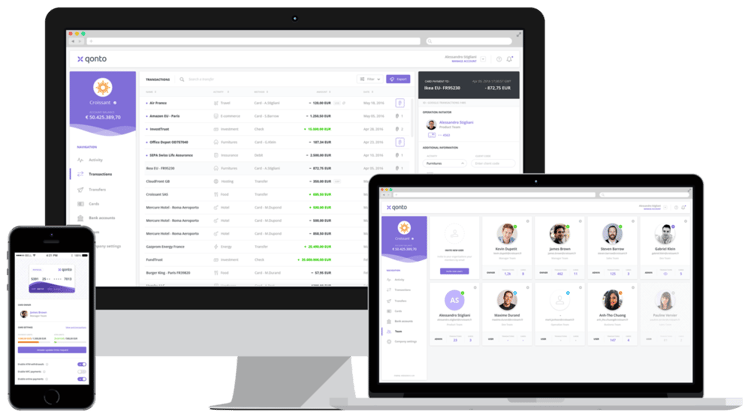
As the importance of mobile banking applications grows, its design takes centre stage too. In the digital banking playground, there has been little innovation design-wise for quite a long time. However, since the growth of challenger banks like Qonto or Bankq, it's clear that the industry is going through an important shift towards better designed digital experiences.
Though there are many factors that influence how and what consumers like in online banking, a great amount is decided by the visual cues, simplicity and usability of interface. As a provider of digital banking experiences, Strands always prioritizes designing solutions that are modern, which is why we decided to share our highlights from the Invision webinar, “How design influences the world of finance,” with key lessons for every bank.
Mobile will become the interface of our entire financial life

“More and more financial decisions will start to happen in mobile devices that otherwise seem very complex” - Apeksha Garga , Director of User Experience Design at Wealthfront Inc.
While there may still be some physical banks in the future, could mobile banking take over fully? In some places this is already starting to happen and creatives have an opportunity to affect businesses. As panelists have highlighted, there are financial transactions and there are financial decisions. Today, the most common operations that we actually carry out digitally are financial transactions, but in the near future the big changes will come from AI and machine learning, and will allow us to create apps and solutions that will help people make financial decisions more efficiently. That´s where great design comes in and helps translate a physical experience run by human beings into something completely digital, like an app. It can only be achieved by creating a human-centered design culture that involves thinking of how we can change and improve the way people interact with money.
No consumer is one-dimensional

“Empathy is the key. This is an essential part of human relations so it has to be translated into the online banking experience as best it can be. We are scared about our finances because it’s a complex topic to deal with. That’s why, as clients, we still rely on humans to perform certain tasks.” - Stephen Gates, GlobalHead of Design, Citi.
With the explosion of data, banks are sometimes sweeping up huge quantities of information about online banking activities and trying to create “connected” products. However, the experiences that are going to win are the ones that make the transition to a relationship, trust and transparency. Customer data will become a growing source of competitive advantage and gaining customers’ confidence and trust will be the key.
The truth is that finance is sometimes scary for both - designers and the end users. Tapping into those emotions and designing solutions that “reconnect” will help to create best experiences that are less scary.
Turning big-data powered interfaces into less complex solutions
It´s absolutely imperative now to design an elegant product that people would find easy to blend into their everyday life.
Design is much more than adding pixels, high-resolution graphics, and converting data into elegantly designed charts. The truth is that the complexity of data in online banking becomes actionable only when presented in an intuitive manner. That´s why quite often the most efficient solutions are those that are simpler and more obvious, unlocking the basic human needs.
On the flipside, banks are not only among the most unlikable brands with the millennial demographic, but one-third of those surveyed believed they would not need a bank at all in the future. When we reflect on the non-traditional digital money management applications like MoneyStrands, N26, Cleo - they gather and transmit tones of complex information in extremely simple visual elements. For example, a “savings goal” feature is pretty complex, but it doesn't equate to anything more than a “piggy-bank” for a millennial using online banking.

Example of Qonto - The Banking Alternative for Entrepreneurs and startups
Therefore, modern applications designed with the consumer in mind act as a “financial advisor.” This is the direction banks should aim for as well.
Big banks competing with disruptive startups
Design is the only way small companies and startups can compete with or even outcompete large financial institutions. There has been a particularly explosive startup boom in the fintech sector and it offers an array of various changes, including design and the way consumers interact with their online banking, because large financial institutions do not always have the ability to react quickly to market needs as startups do. Therefore it becomes so difficult to be disruptive. This is where design can take the lead and become the key factor in order to be competitive in the market. The question is what´s the true nature of this relationship between banks and startups that are beginning to dictate the rules?
At Strands we believe that it's much more of a give-and-take relationship between startups and banks - it´s a collaboration that keeps both parties in the game. 2017 is a great moment and opportunity for innovating and refining your online banking strategy, with an eye towards balancing a useful, human-centric and user-first perspective.
The article originally posted on blog.strands.com
Authors:
Vaida Pakulyte, Digital marketing manager at Strands.
Guillem Espias, UI/UX Designer


